
Nonprofit websites are the first line of communications for anyone interested in our work on the ground, the services we provide, and how to get involved. But did you know that there’s a science behind how you interact with different websites? Website developers work to optimize content and design to boost traffic and strengthen brand recognition. Enter: UX Design.
UX – or “user experience''– describes the experience people have when they visit your website. In other words, it’s everything that affects a user’s interaction with a digital product. That means we have a responsibility to ensure that everyone who visits your site can trust your brand.
Flow
The first priority in UX design is understanding a user’s goals and needs to think about how users will move through your site. This is where flow comes in. Visitors are more likely to notice things at the top of the page, so put your most important information first. Also make sure that your main navigation has all of the important information that you want your audience to find. Your site should be consistent and easy-to-use: don’t make it impossible for users to find the information they’re looking for!
Color
Let's talk about color. Designers can spend hours experimenting with color, tweaking different palette combinations and adjusting hues to best represent various ideas. But what if all of that hard work was completely lost on the viewer?

(credit: vwo.com)
People with low vision have a much better experience when there is enough color contrast between color background and text, as well as foreground and background colors. When designing, an easy way to ensure contrast is to opt for complementary color combinations.
Font
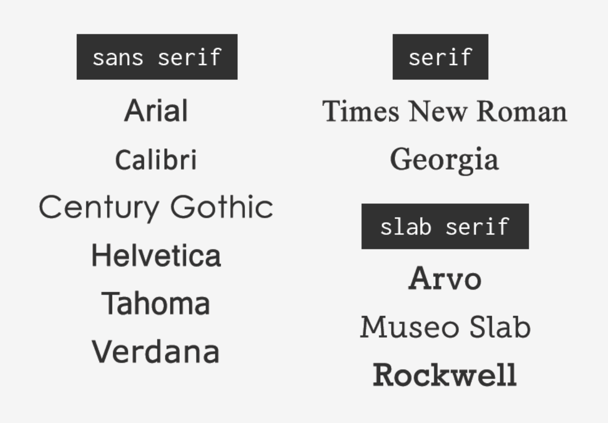
Choosing an easy to read font is important. Sticking with commonly used fonts – and avoiding decorative or cursive font styles problematic for readers with dyslexia – is your best bet. Common fonts you should consider including on your site:
Sans-serif font families: Arial, Calibri, Century Gothic, Helvetica, Tahoma, and Verdana
Serif font families: Times New Roman and Georgia
Slab serif font families: Arvo, Museo Slab, and Rockwell
(credit: envato.com)
Flow, color and typography are only a few of the ways nonprofits can make their websites more accessible. While it may be impossible to have a design that is accessible to all at once, as nonprofits, we can work towards a UX and design experience that can help bring people together.